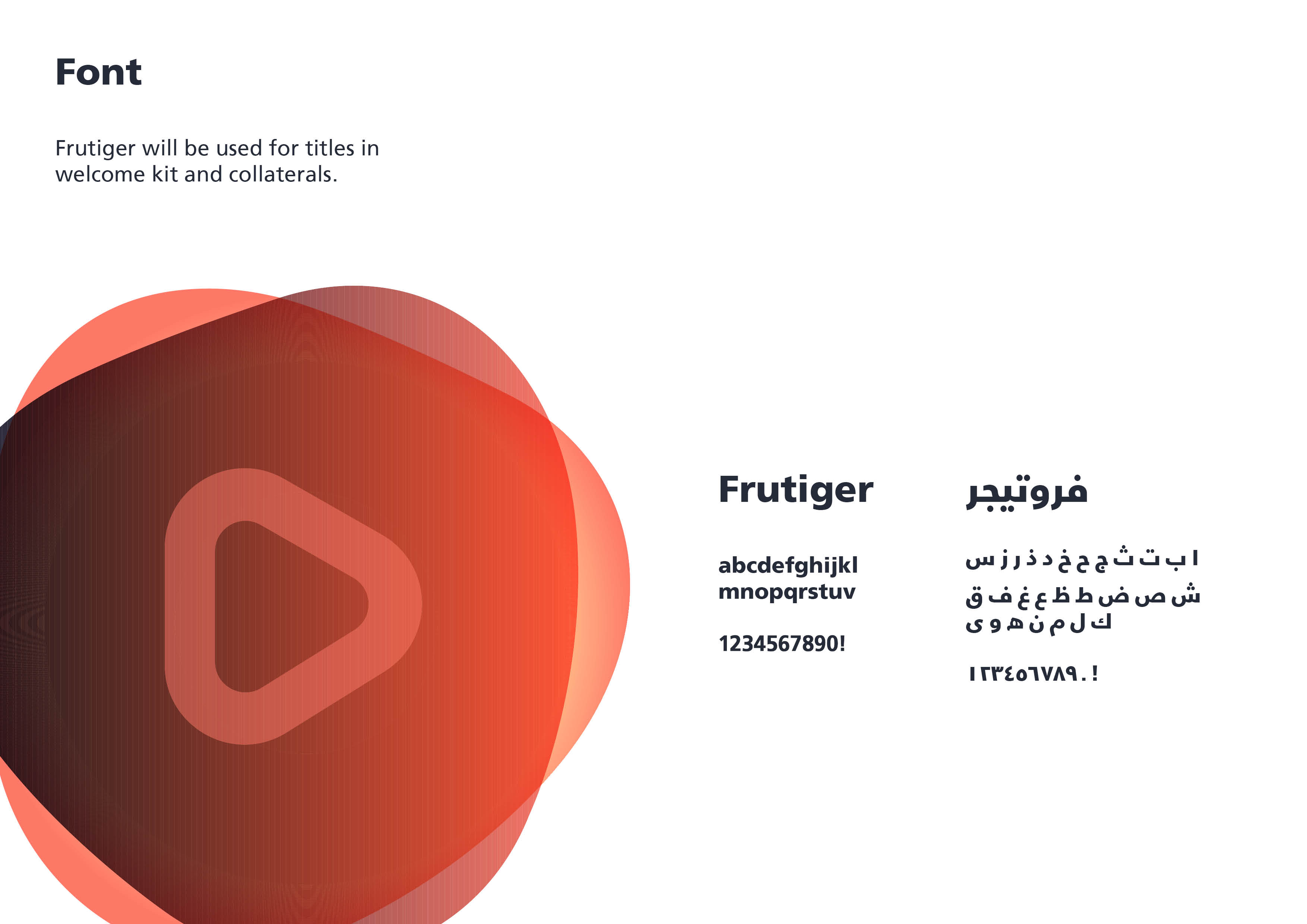
Rebranding of a governmental event. I was given an old logo to rebrand. By fixing the typography, adjusting the logo, and changing colors, I was able to create two different identities.
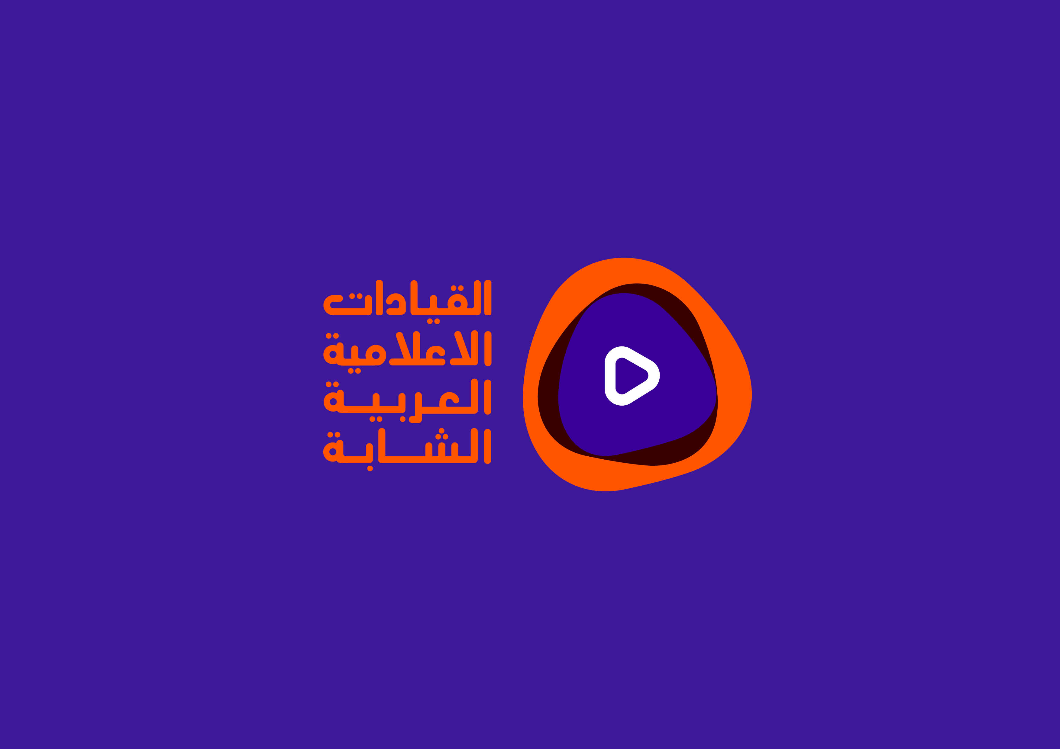
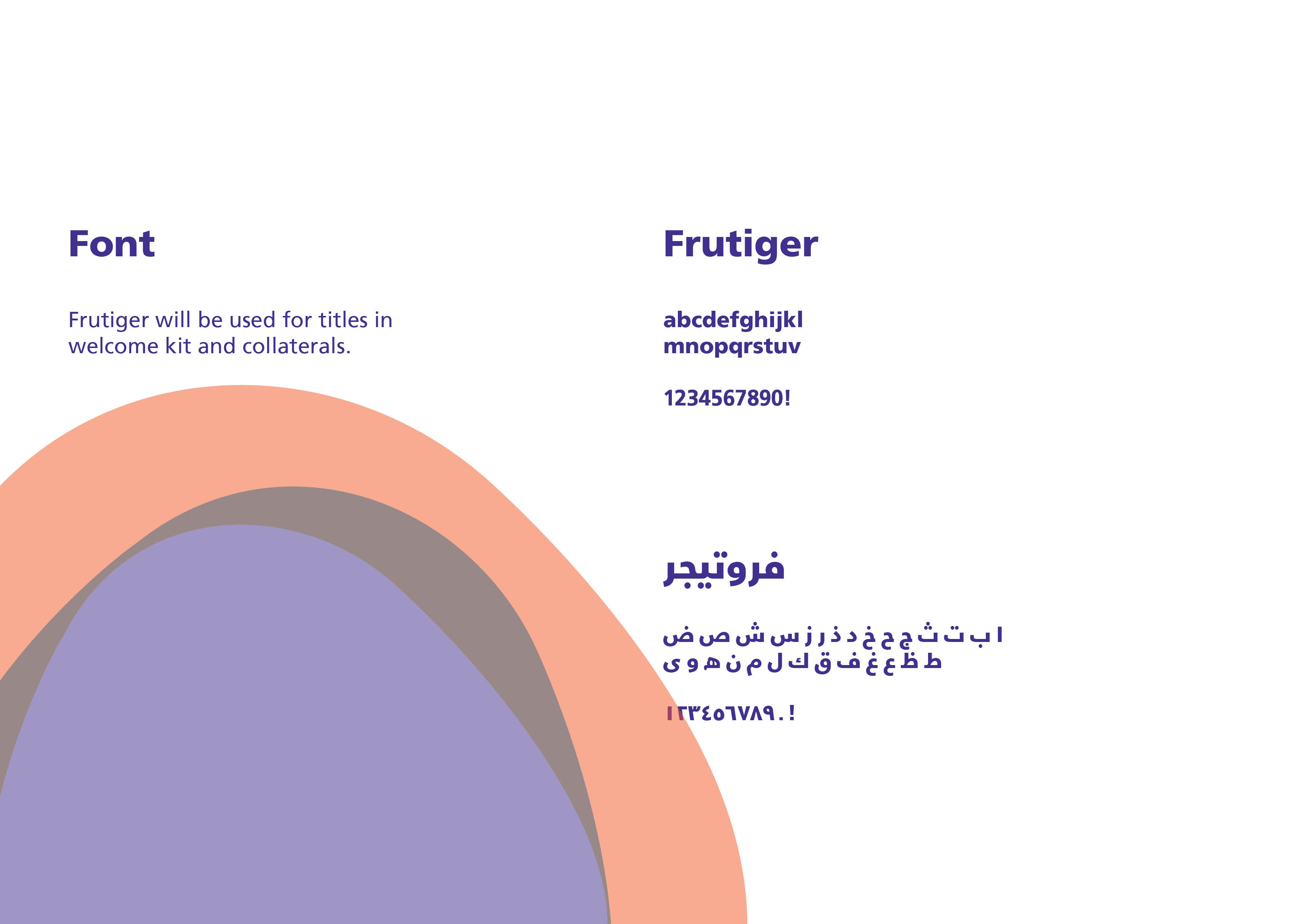
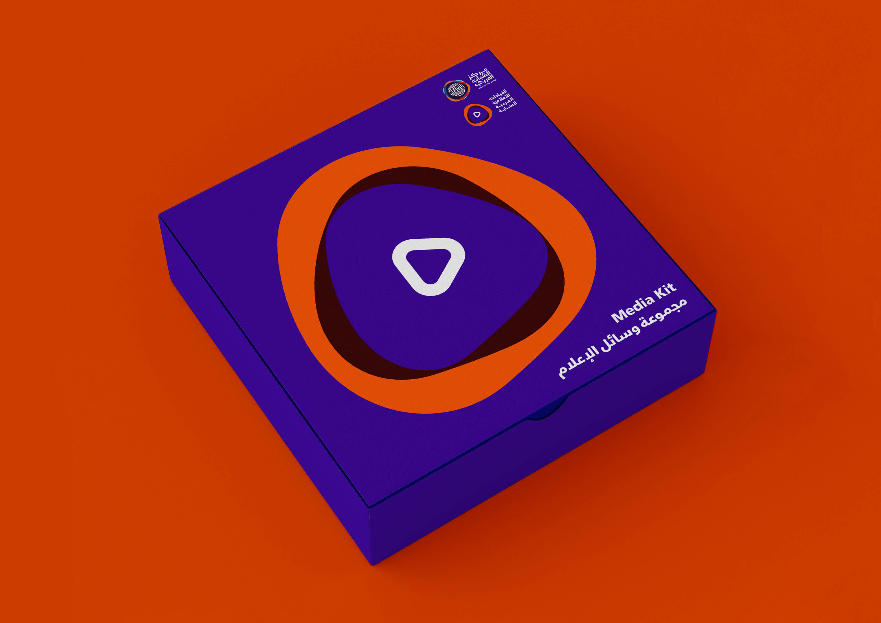
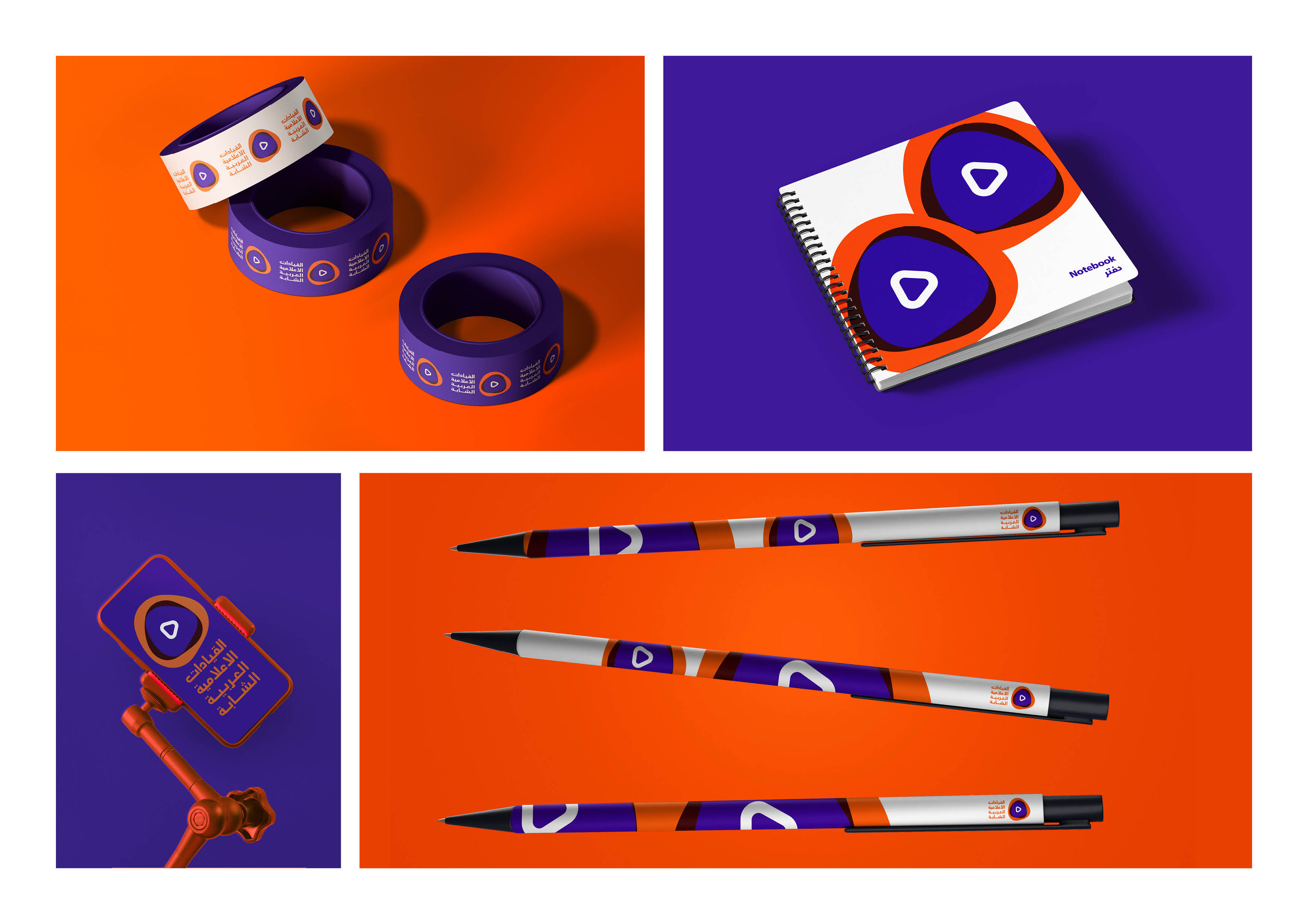
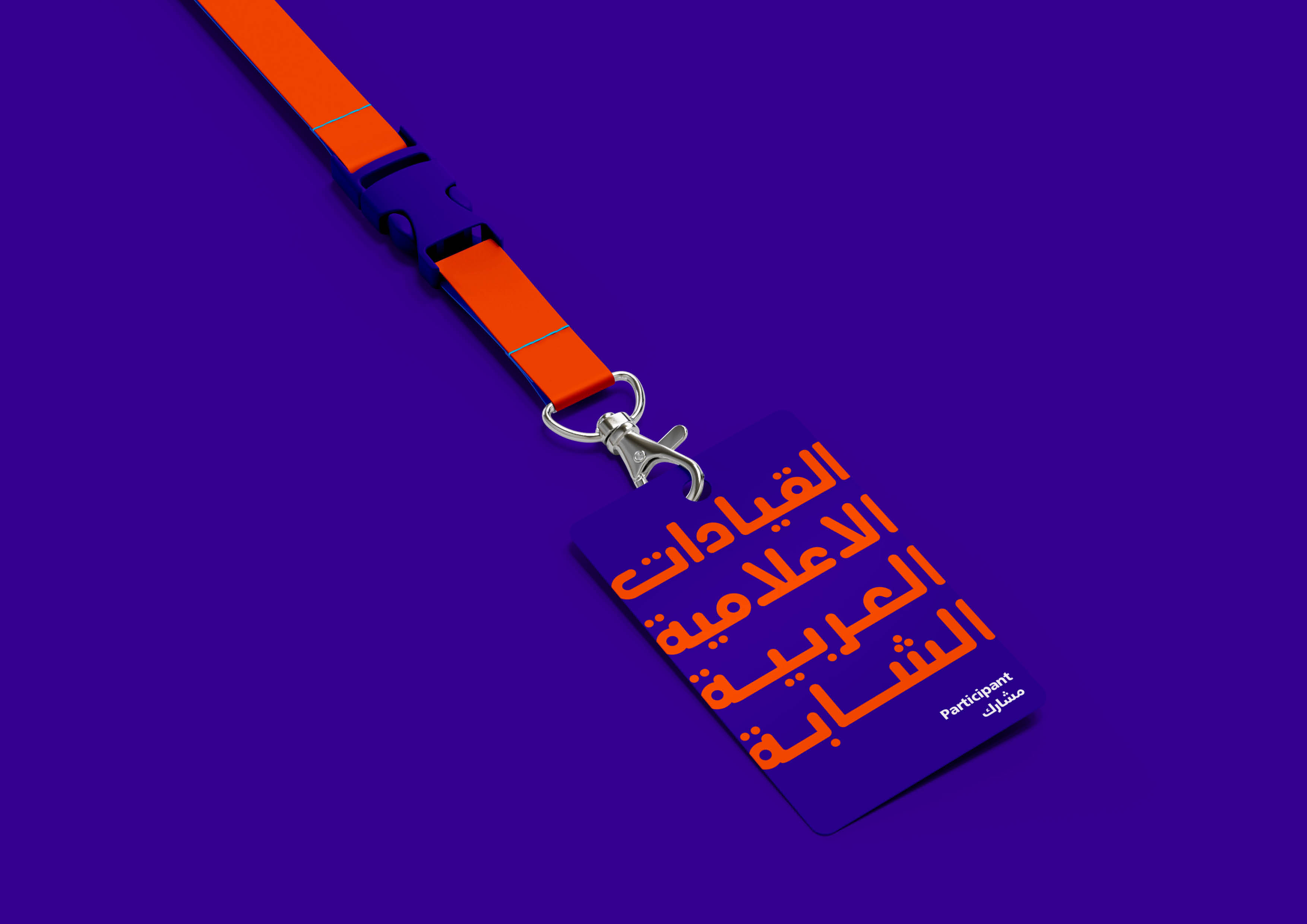
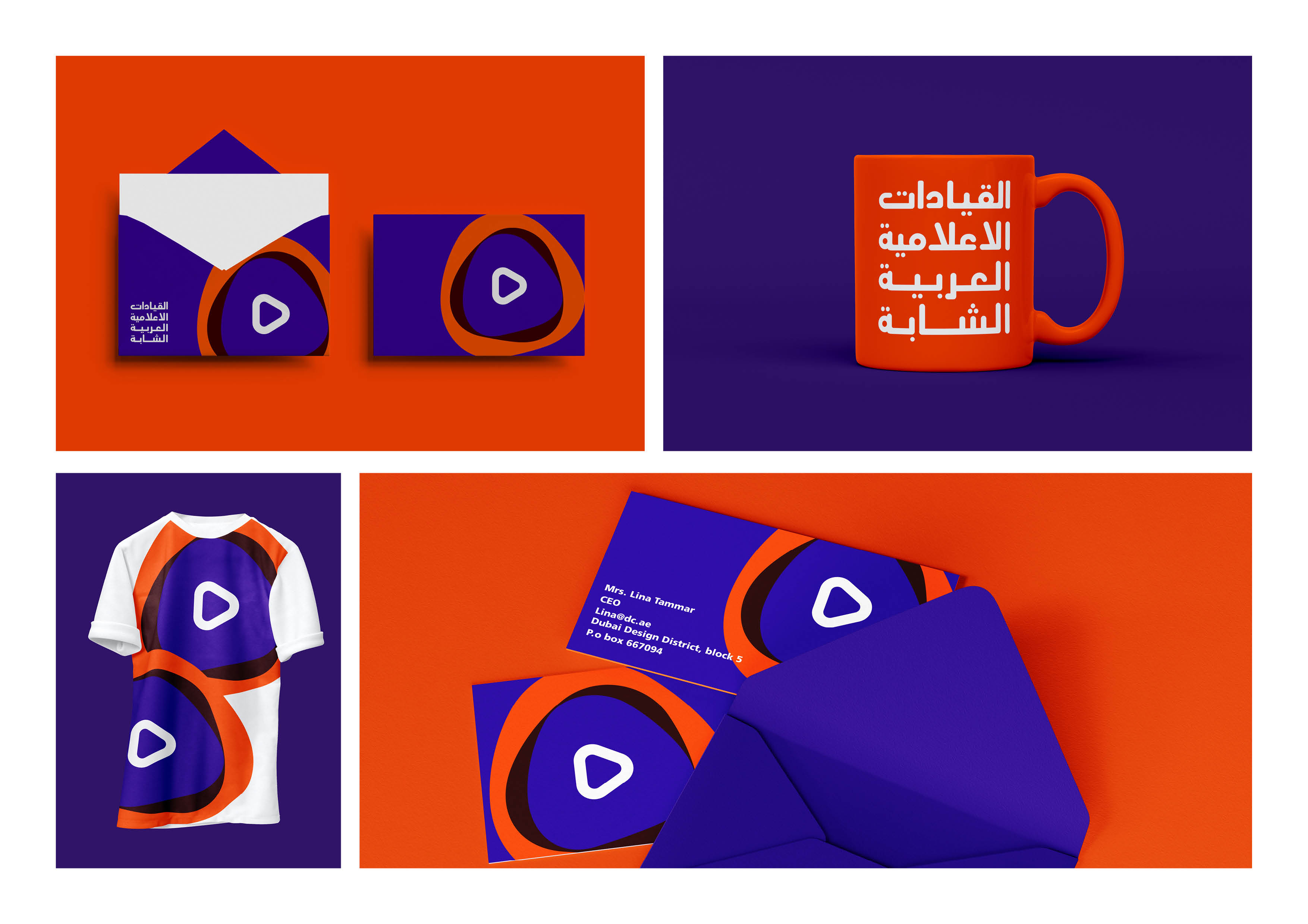
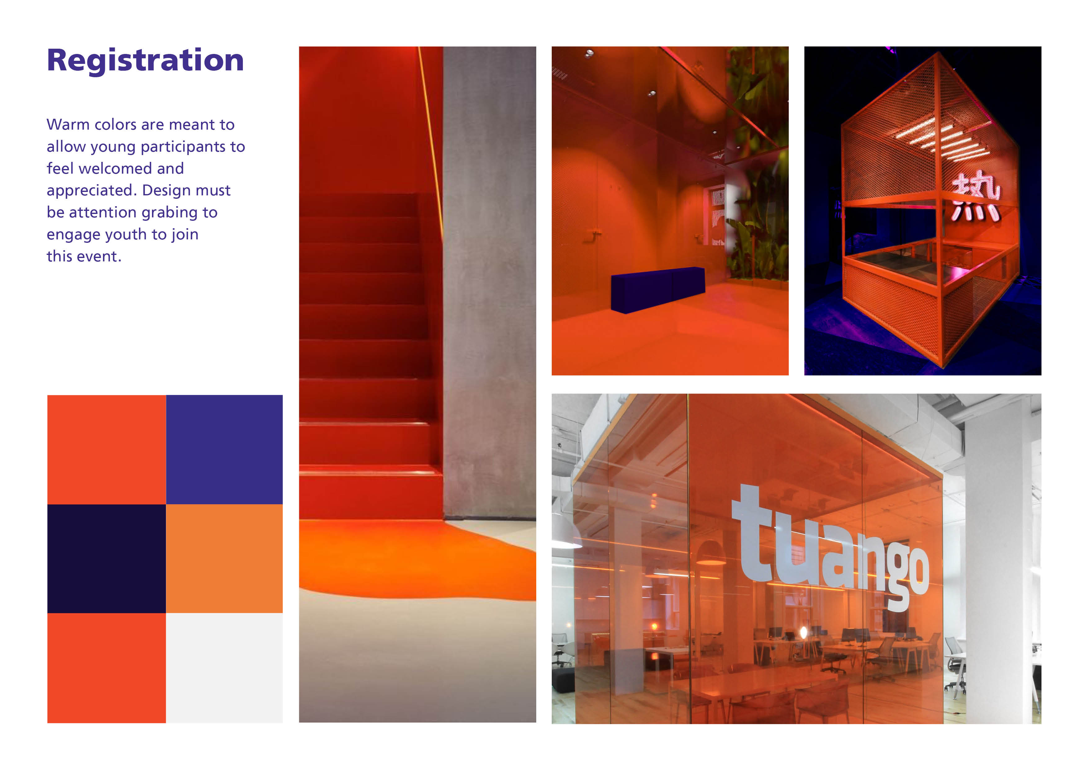
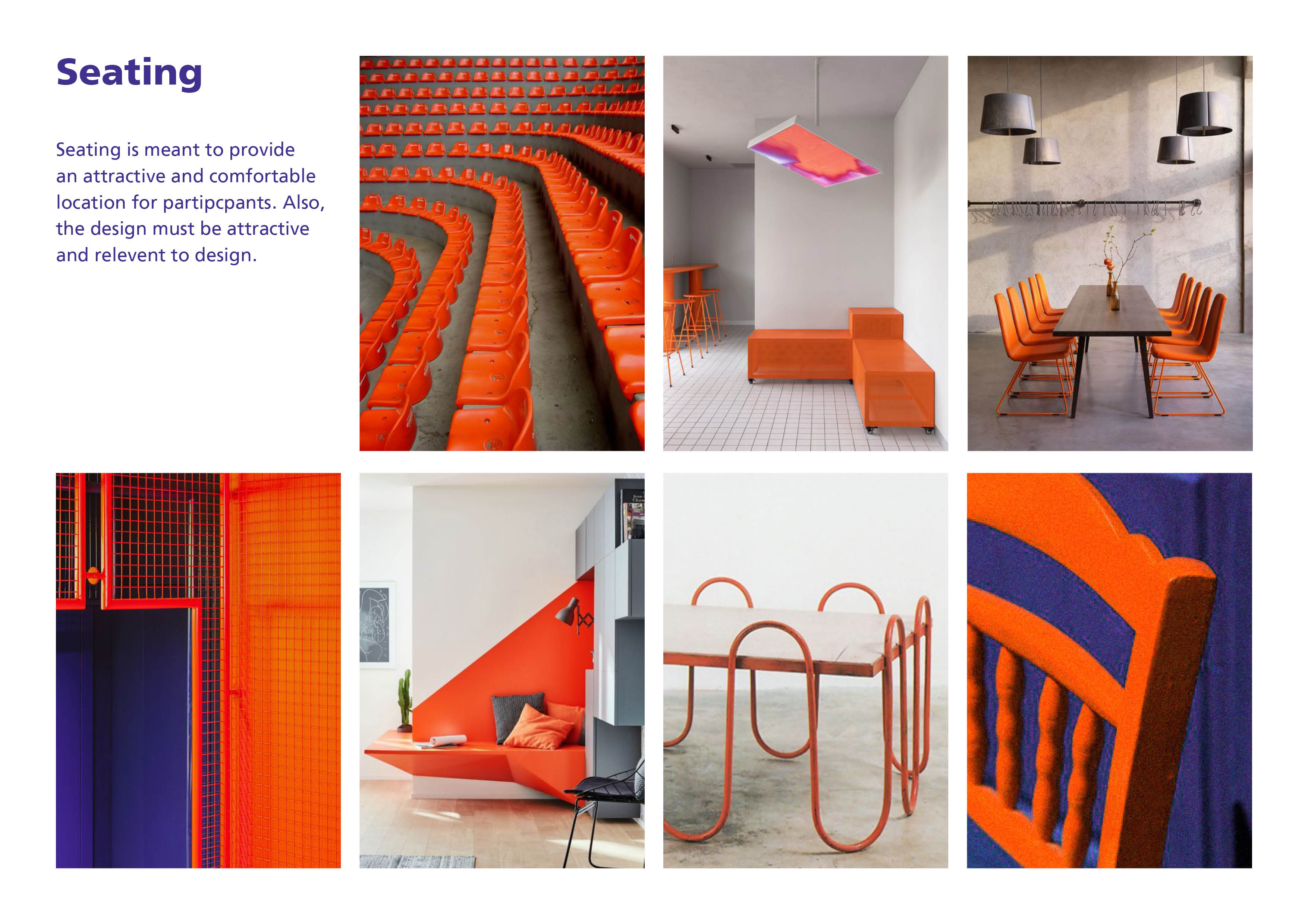
The first identity, which is in orange and purple, is taking a fun experimental approach. I used colors opposite each other on the color wheel, to attract the attention of young people. I was asked to create a tool kit and wanted it to be very vibrant and attractive. It’s a room where young designers would like to share on their social media to help attract others. The event room itself was very modern and trendy.
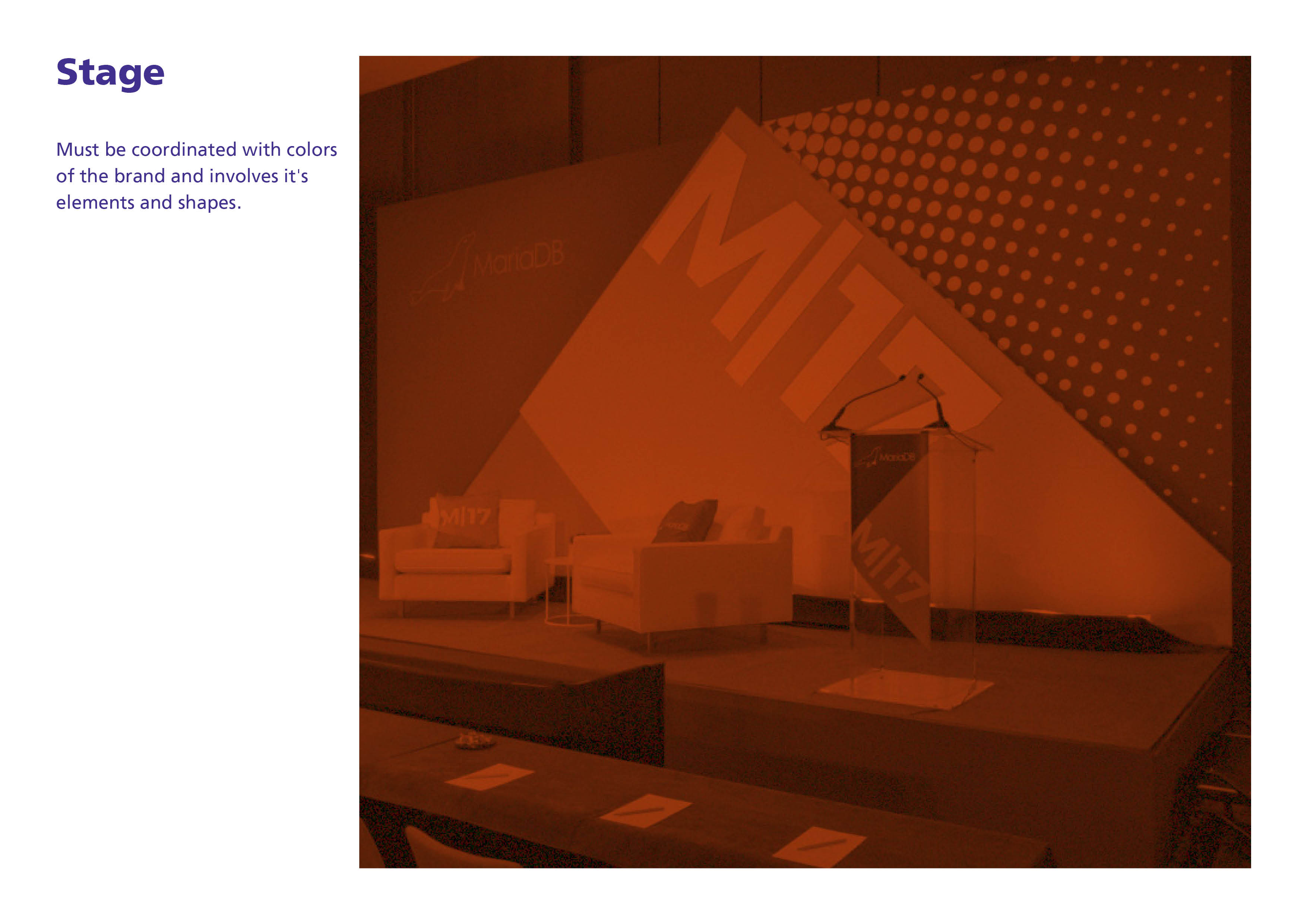
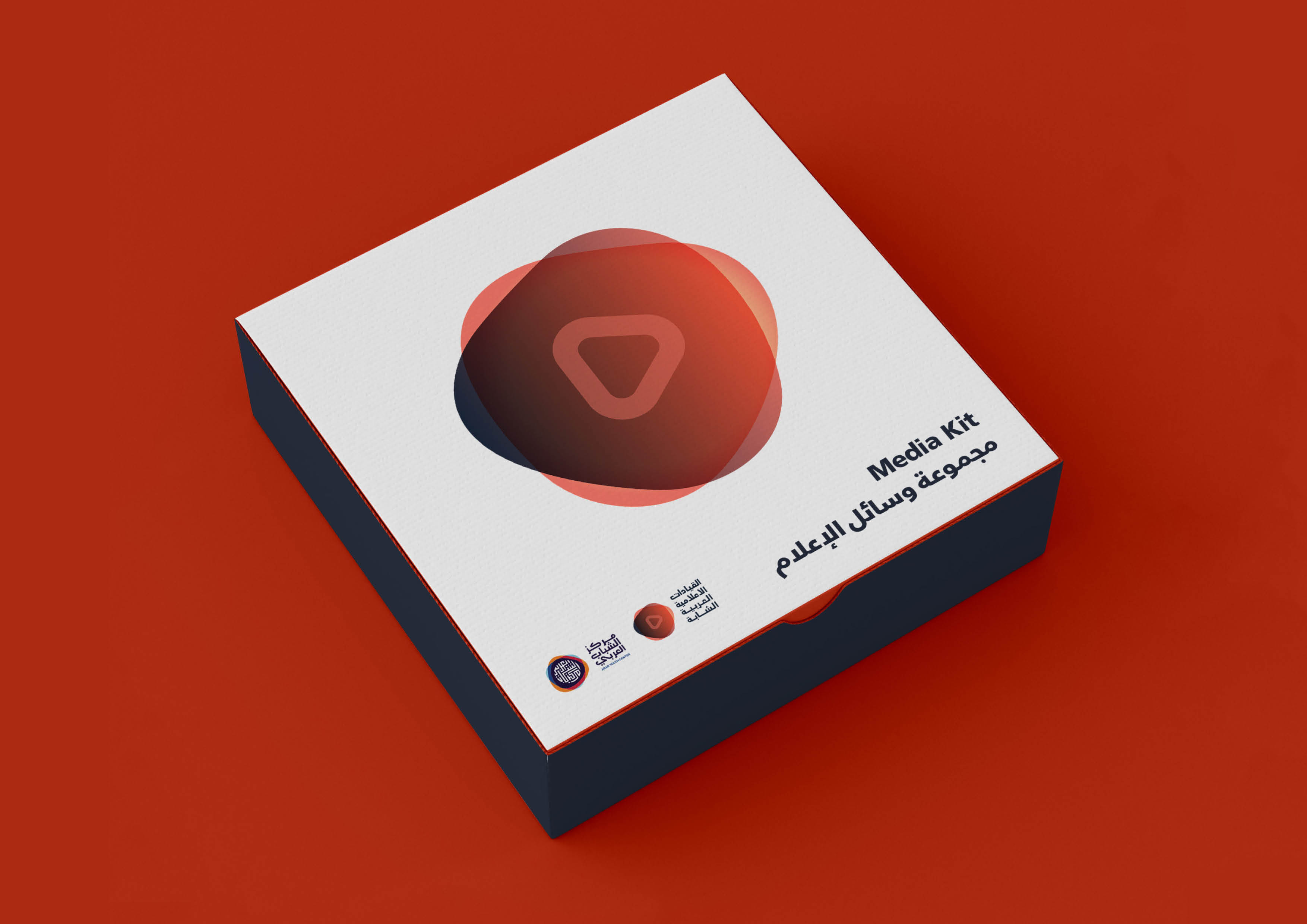
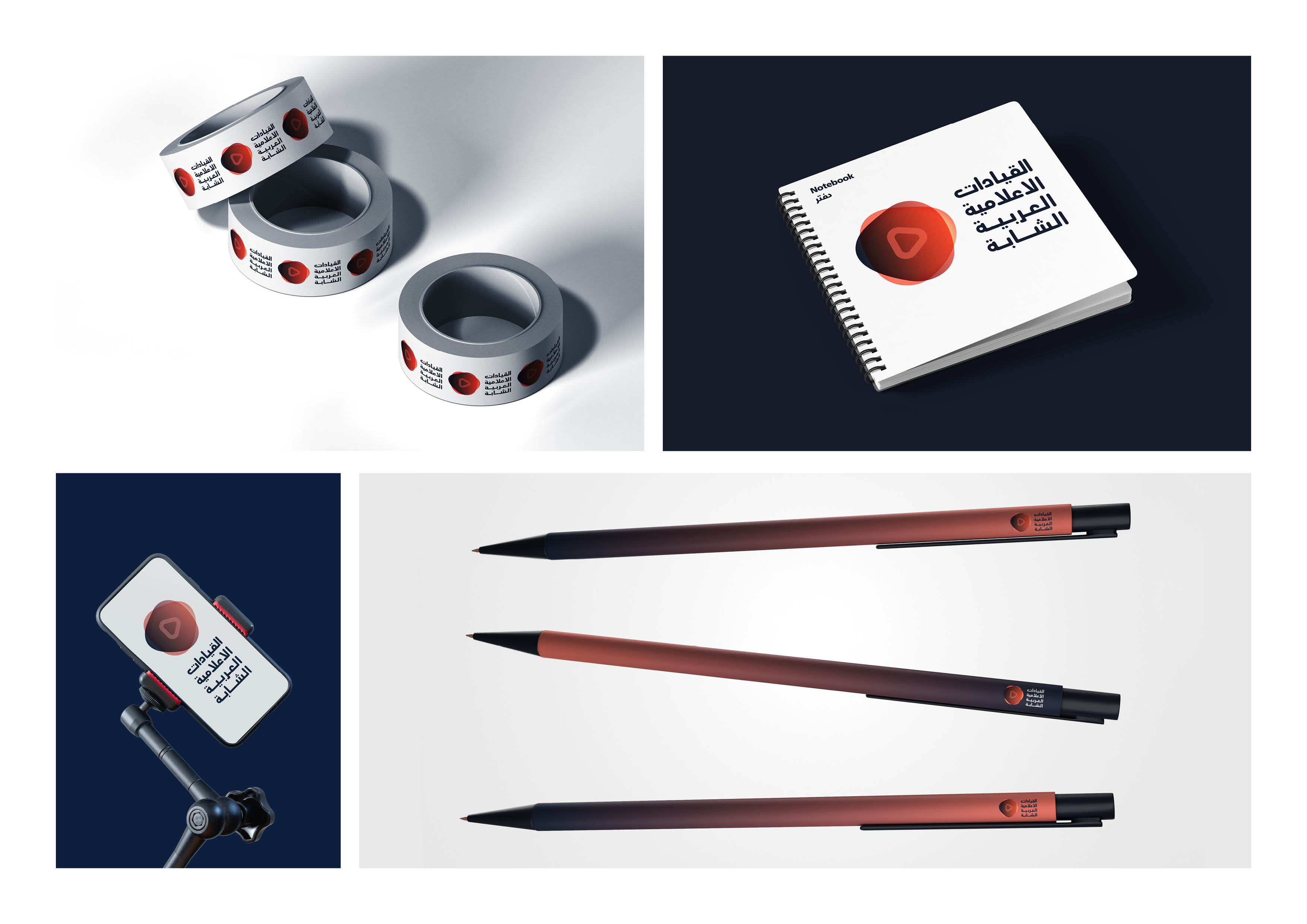
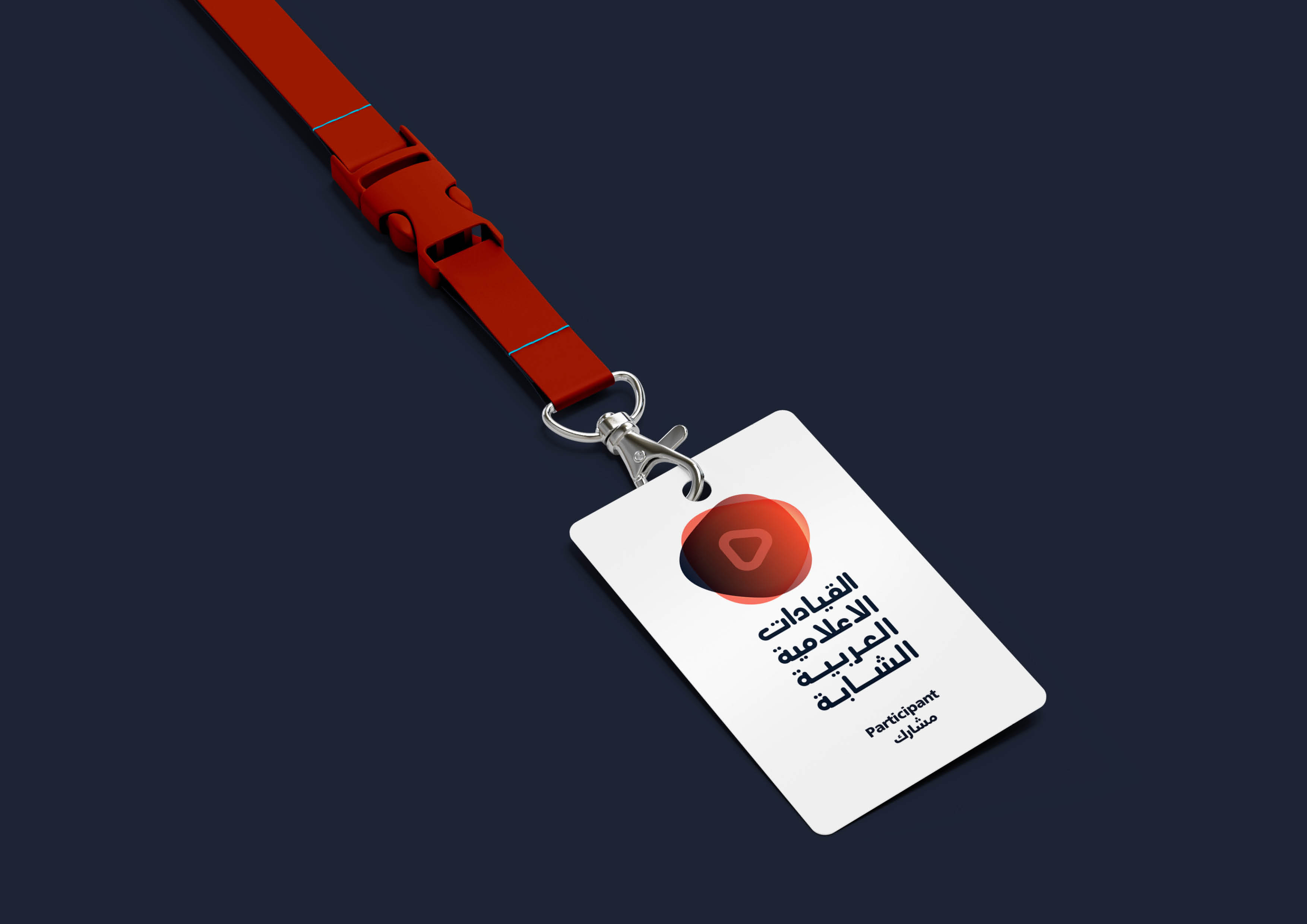
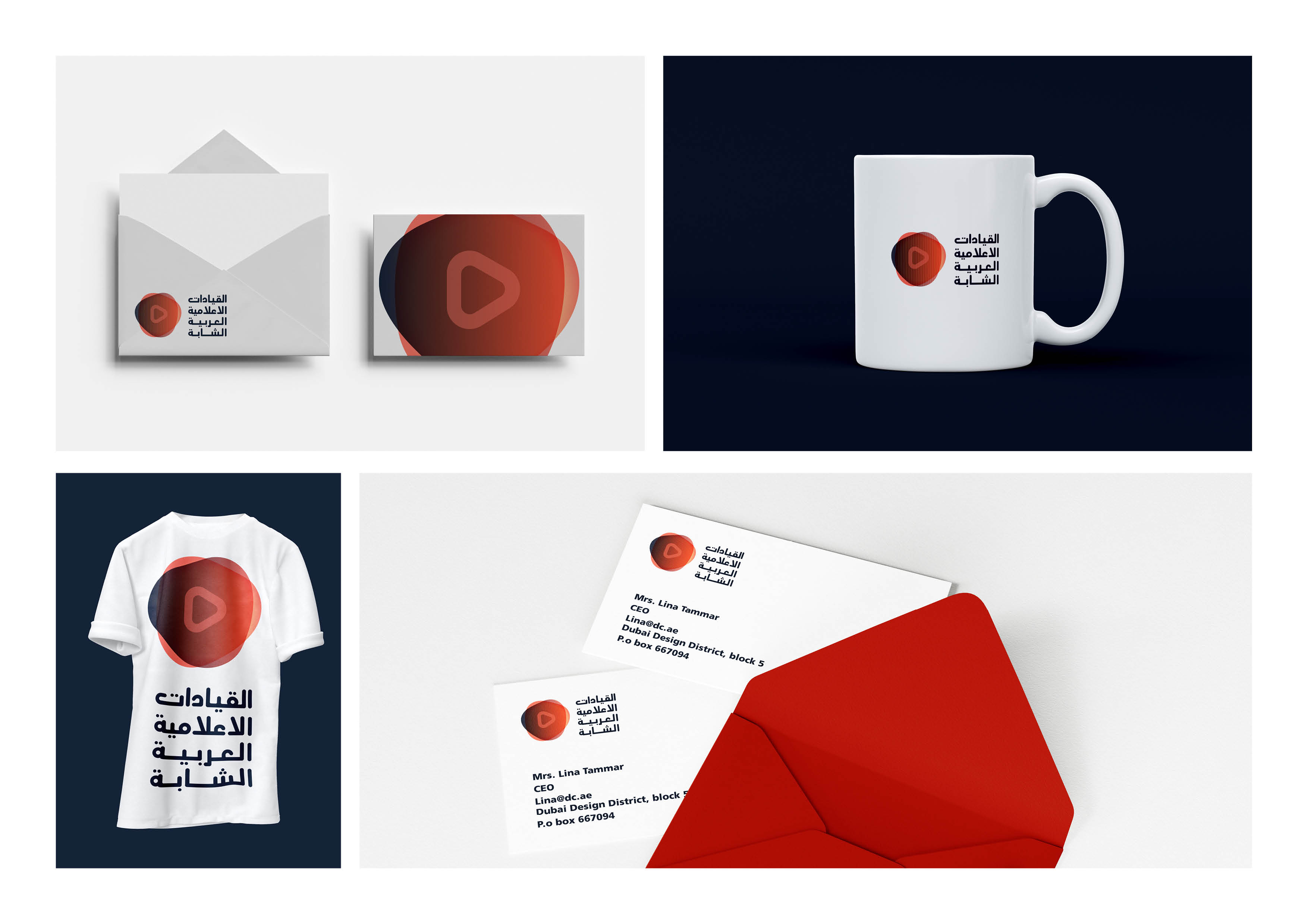
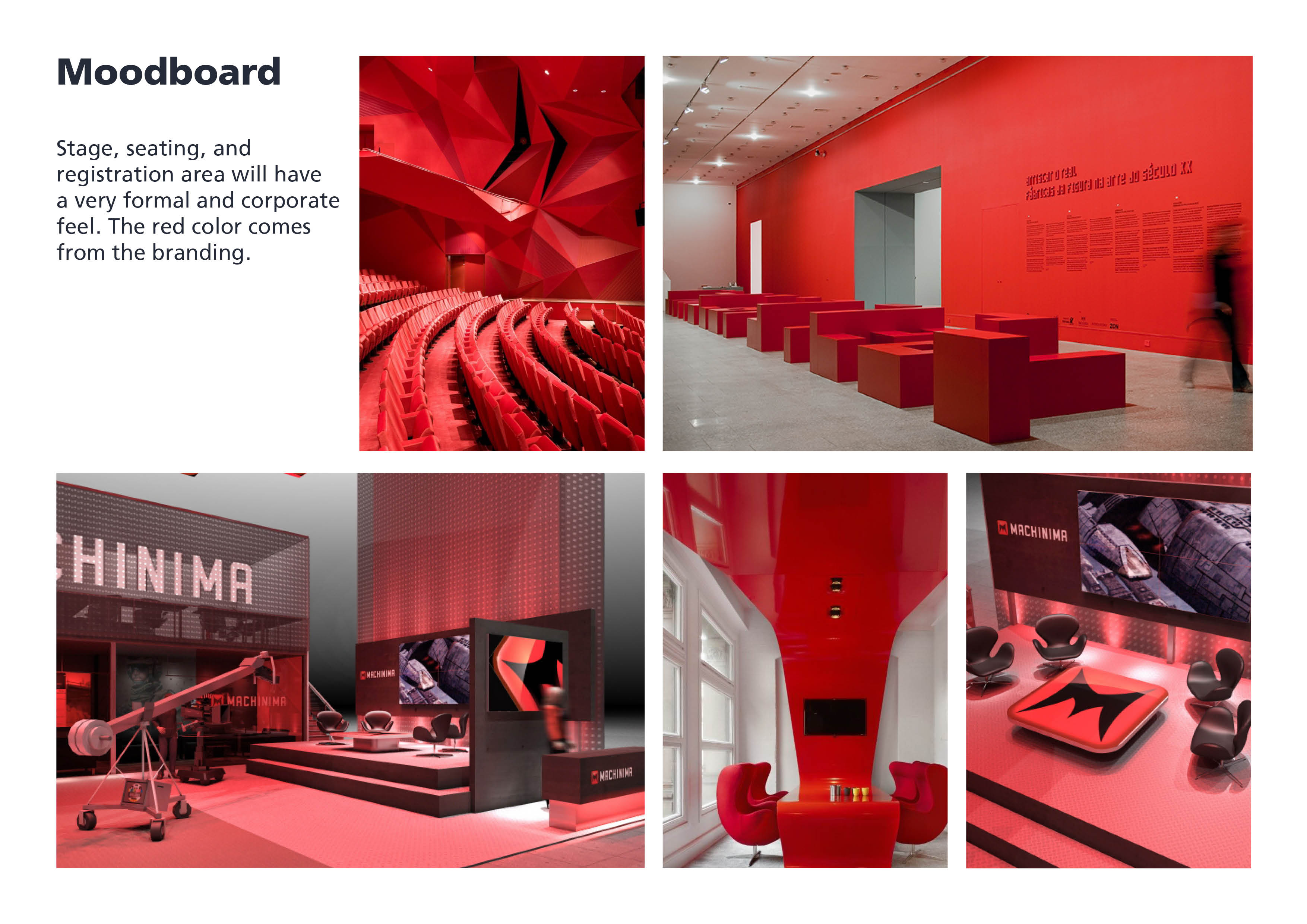
On the other hand, the corporate logo made it more professional to demonstrate that it was a governmental focused event. The colors are simply red, yellow, dark blue. This gives a serious tone to the attendees. The tool kit is a lot less playful and the stage is more professional.
![]()
![]()
![]()
![]()
![]()
![]()
![]()
![]()
![]()
![]()
![]()
![]()
![]()
![]()
![]()
![]()
![]()
The first identity, which is in orange and purple, is taking a fun experimental approach. I used colors opposite each other on the color wheel, to attract the attention of young people. I was asked to create a tool kit and wanted it to be very vibrant and attractive. It’s a room where young designers would like to share on their social media to help attract others. The event room itself was very modern and trendy.
On the other hand, the corporate logo made it more professional to demonstrate that it was a governmental focused event. The colors are simply red, yellow, dark blue. This gives a serious tone to the attendees. The tool kit is a lot less playful and the stage is more professional.